Interpreting Graphs


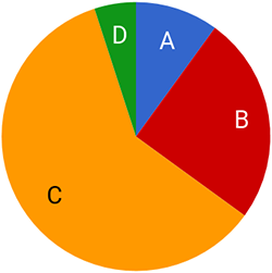
1. Mr. M’s class grades were graphed as a pie graph. Based on this graph:
a) The largest percentage of students received what grade? ________
b) Estimate what percentage of the class received a B. ___________
c) Estimate what percentage of the class received an A. ___________
d ) Based on the graph, do you think Mr. M’s class is difficult? Why or why not?
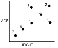
2. The scatter plot shows a bus stop where those waiting at the bus are plotted by their height and by their age. Identify which dot goes with which passenger.

3. The bar graph compares the number of students enrolled in classes.
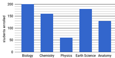
a) What class has the highest enrollment? ____________
b) How many students are enrolled in Chemistry? _____ Anatomy? ____
c) Which course is the least popular? ___________
d) A new course is added; forensic science has 160 students enrolled. Add this bar to the graph shown.
4. This line graph compares the growth of plants that were kept in the sun for different amounts of time.
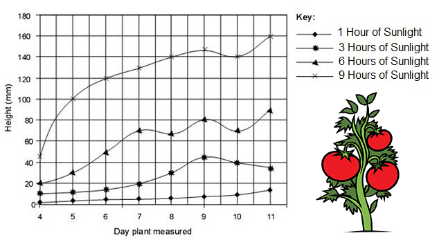
a) On Day 7, the plants kept in the sun for 3 hours were how tall? _________
b) On Day 7, the plants kept in the sun for 6 hours were how tall? _________
c) On Day 10, the plants kept in the sun for 9 hours were how tall? ________
d) On Day 11, the plant that was grown with 1 hour of sunlight was how tall? ________
e) Based on the graph, the plant grows best in what amount of sunlight? __________
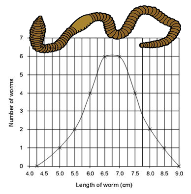
5. The line graph shows the number of worms collected and their lengths.
a) What length of worm is most common? _____________
b) What was the longest worm found?_______
c) How many worms were 6 cm long? _______
d) How many worms were 7.25 cm long?_______
e) The peak of the curve represents the
[ longest worms / average worms ]
 This work is licensed under a Creative Commons Attribution-NonCommercial-ShareAlike 4.0 International License.